Directed by Alma Har’el and production designed by JC Molina, the 2024 limited series Lady in the Lake—starring Natalie Portman—isn’t just set in 1966 Baltimore; it dissects the city’s racial and gendered fault lines through its spaces. As production designer JC Molina told us, every location was designed to reflect “who had power, who didn’t, and who was allowed to move through these worlds.” The Lady in the Lake production design makes this vision visceral: sets transform into psychological battlegrounds, from the Schwartz residence’s constricting floral patterns to the Lafayette Bar’s neon that burns through the night like a warning.
These are spaces that accuse. The Schwartz family’s home, with its George Stacey-inspired wallpapers and surreal basement putting green, becomes a gilded cage for Maddie’s stifled ambition. Meanwhile, Cleo Sherwood’s Baltimore thrums in the margins—in Lucille’s salon, where vintage pressing combs and Jet magazine ads line the walls, and in the Lafayette’s defiant glow, a beacon for those the city ignores.
What emerges is Lady in the Lake’s most potent storytelling device: production design that doesn’t recreate history, but interrogates it. From Hecht’s department store’s exclusionary cosmetic counters to Shell Gordon’s Italian-furnished office of hard-won power, these sets don’t just surround the characters—they stare down the audience, demanding we ask: Who was this city built for?
This exclusive deep dive into Lady in the Lake‘s production design reveals how JC Molina and Karuna Karmarkar‘s team translated Alma Har’el’s vision into tangible spaces that breathe with historical truth. Beyond period accuracy, these sets become silent narrators of Baltimore’s divided soul.
Lady in the Lake Production Design: Anatomy of a Divided City
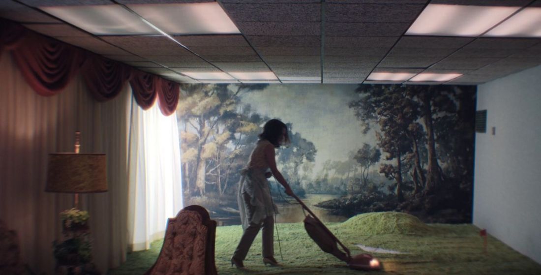
The Schwartz Residence


The Schwartz residence, filmed on location in Pikesville—a historically Jewish neighbourhood in Baltimore—underwent a complete transformation to align with the envisioned colour palette and character details. The team carefully selected wallpaper, carpeting, and custom drapery for each room. The whimsical basement bar, featuring a putting green and forest mural, blurred the line between the show’s dream sequences and period-accurate reality. Inspiration came from home decor magazines of the era, as well as a photograph of New York socialite Babe Paley in her George Stacey-decorated living room. Additional references included the work of interior designer Dorothy Draper and Larry Sultan’s photographs from his book Pictures from Home.
Hecht’s Department Store


Originally an Under Armour gym, the Hecht’s Department Store location required a full overhaul to match its mid-century retail grandeur. Historical photos of iconic department stores—including Baltimore’s original Hecht’s, Hutzler’s, Stewart’s, and Chicago’s Marshall Field’s—guided the design. The team removed modern gym equipment to reveal the building’s original Hildreth Meière mosaic tile flooring. Custom display cases were fabricated, and the space was filled with period-appropriate merchandise, from cosmetics to clothing. A 30-foot Christmas tree completed the festive atmosphere, while vintage brands like Caswell Massey and Mason Pearson stocked the cosmetic counters.
Lombard Market

Lombard Street in Baltimore still houses Attman’s Deli, the oldest Jewish deli in the U.S., founded in 1915. The art department transformed a market co-op into a bustling period-accurate shop, stretching an entire city block. Vintage food scales, barrels, cash registers, and locally sourced products from brands like Tulkoff’s and Joyva Halva filled the space. Custom neon signs and stall signage reinforced the historical aesthetic, drawing from archival images of Lombard Street and other mid-century Jewish markets.
Shell Gordon’s Office

Shell Gordon, the high-profile Numbers King in Lady in the Lake, required headquarters that reflected his power and sophistication. His office featured Italian-imported wallpaper, an executive desk, and a striking cubist painting. A green velvet-upholstered sofa tied the room together, while his interest in exotic fish hinted at an intellectual curiosity for the finer things in life.
The Silver Dollar Diner


Inspired by photographer Fred Herzog’s vivid Kodachrome imagery, the diner’s design embraced sharp greens and orange-red tones—dubbed “Herzog red” by the team. The counter, booths, and barstools (salvaged from Baltimore’s now-closed Woodberry Kitchen) were custom-fabricated or repurposed. Vintage appliances, tableware, and custom drapery completed the nostalgic atmosphere.
The Baltimore Star


The newsroom set was designed to feel chaotic and layered, mirroring the energy of a mid-century newspaper office. After studying references like the Baltimore Sun, the team filled the space with tanker desks, vintage typewriters, and period-appropriate office supplies—down to the pencils and thermoses. Additional sets included an editor’s office, lobby, and even an incinerator room, ensuring every corner felt authentic.
Lucille’s Salon

A real salon in Baltimore’s Hamilton neighbourhood was transformed into Lucille’s, a 1960s beauty parlour catering to the Black community. The team researched ads from Jet magazine to ensure hair products and tools were era-appropriate. Custom graphics replicated vintage advertisements, while Warner Bros. Props supplied the salon chairs. A dusty pink colour scheme and a custom-upholstered MCM sofa with a chenille blanket added bespoke touches.