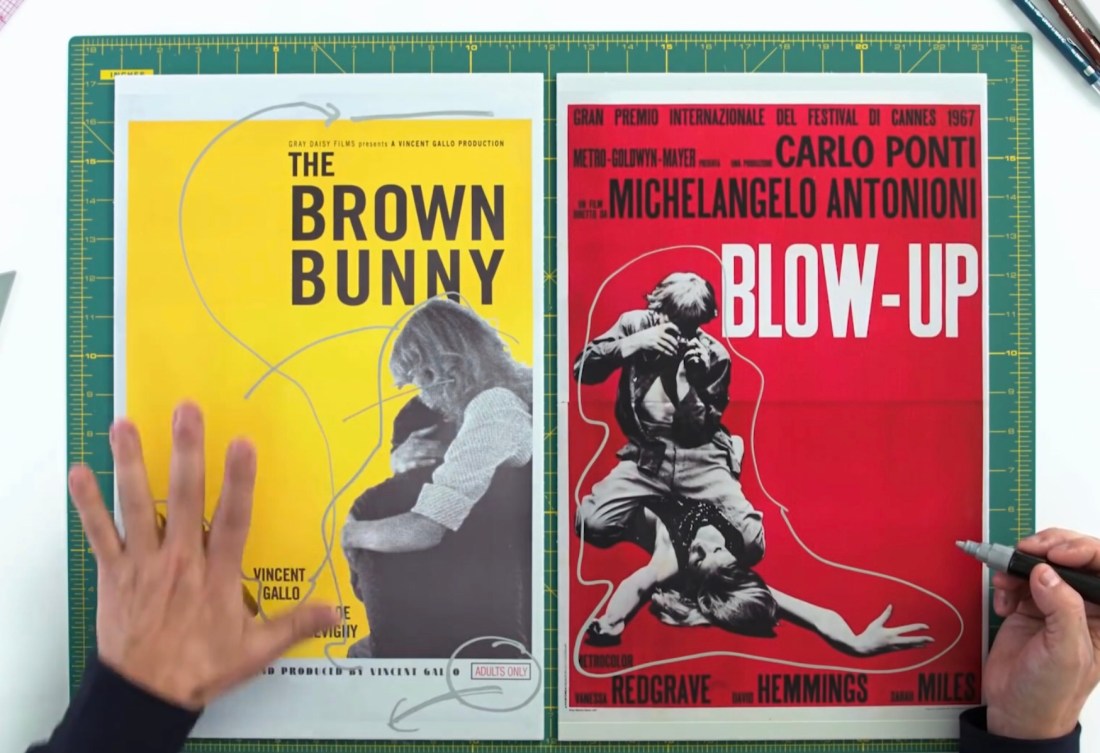
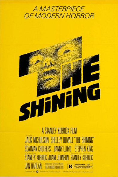
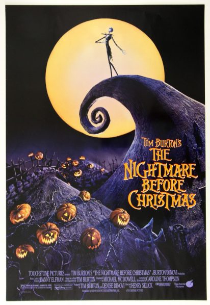
I love the practical creative advice Movie Poster Artist James Verdesoto gives in the videos below about movie poster design principles and fundamentals. I get really excited when I’m designing a project that requires movie posters to be designed. My graphic designers know how picky I am about poster design and always bring their A-game despite the time constraints.
If you’ve been reading this site from the beginning, you may remember how much I obsess over film poster design sometimes. When I was in high school, I used to collect movie posters, the full-size and 8 1/2 x 11 versions, of course. My bedroom and locker were plastered with them (as well as the many boy band posters- let’s be real).
Over the years, I have definitely noticed how often we see the same shapes, colours, and layering of faces for similar genres, and I never quite understood it. Watching these videos made me understand the psychology behind it and really appreciate the techniques and process of the movie poster artist. Film poster design is much harder and more thought-provoking than it looks.
Movie Poster Design Principles as Explained by Poster Artist James Verdesoto
Movie Poster Design Colour Schemes and Genre Guides
Movie Poster Design Analysis: Marvel Movie Posters
Movie Poster Design Analysis: Remakes vs Originals
I bet you have a new appreciation for movie poster design principles and the colour yellow. What is your favourite movie poster, and why? I’d love to know in the comments below.


