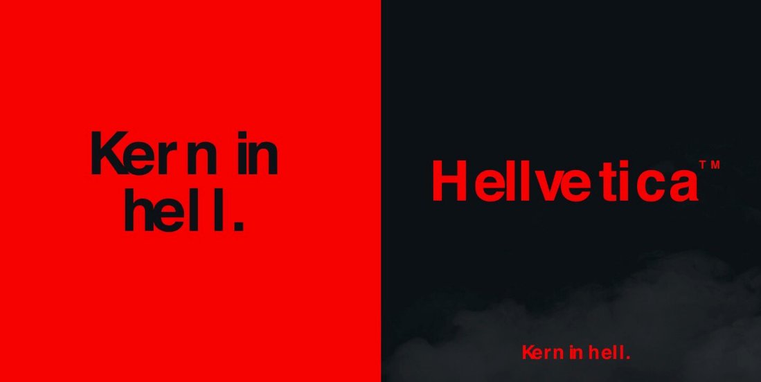
In the spirit of Halloween, prepare to be petrified by this Hellvetica typeface which looks to horrify your senses and push the boundaries of your typography OCD. This new adjustment of the Helvetica font was developed by creative director Zack Roif and designed by Matthew Woodward. Both Zack and Matthew are creative directors at R/GA where they clearly enjoy annoying their co-workers with purposely bad typography like Hellvetica.
“Welcome to type purgatory.”
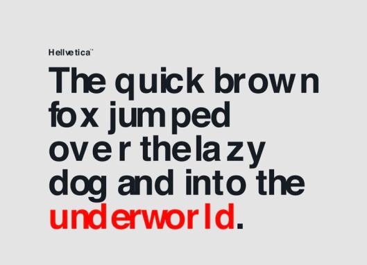
What I find particularly fun about this Halloween themed font is the use of Helvetica as the base. Helvetica, formerly known as Neue Haas Grotesk, is one of the most popular and ubiquitous sans-serif typefaces created in 1957 by Swiss typeface designer Max Miedinger. Helvetica was successfully designed to be the most legible and clean typeface as is discussed at length in Gary Hustwit’s popular documentary, Helvetica. Earlier this year, Monotype released an updated version of Helvetica to redesign it for the digital age. Now Zack Roif and Matthew Woodard have dared to ruin it with their filthy Hellvetica font.
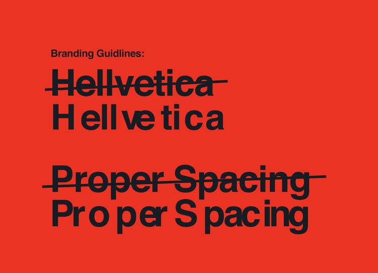
Perhaps this Halloween or April Fool’s Day it could be fun/horrible to replace your graphic designer’s Helvetica typeface with the Hellvetica font and watch the horror on their face when they try to mercilessly adjust the kerning to no avail. Then hope they don’t hate you and quit. You can download the Hellvetica typeface for free at HellveticaFont.com, but don’t you dare ever use it on anything I work on!
This Hellvetica Typeface Will Make You Nauseous Share on XHellvetica Typeface Purgatory


Would you ever use the Hellvetica Typeface just for fun? I’d love to hear your thoughts on this typography in th e com me nts be low .