I came a little late to Sharp Objects, but I am so glad I watched this television miniseries. It’s a psychological thriller released on HBO in July of last year, which made big waves after its premiere, but it was Sharp Objects production design that initially piqued my interest after several people had recommended I see it.
“The most important thing I do as a designer is to create a sense of place and a sense of atmosphere.”
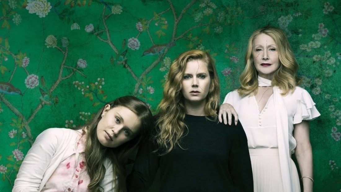
While Sharp Objects production design is impressive, yes, it also has some of the best performances of the last year. Patricia Clarkson and Amy Adams are remarkable as always. The script and cinematography are haunting, and the costume design is very thoughtful. After watching it this past winter, I had many questions about the sets that I am very thankful production designer John Paino was able to answer for me below in a great conversation we had recently.
Sharp Objects is based on Gillian Flynn’s debut novel of the same name, about a crime reporter, Camille Preaker, who suffers from alcoholism, is discharged from a psychiatric hospital after years of self-harming, and returns to her hometown of Wind Gap, Missouri, to investigate the murders of two young girls. Upon arriving at her childhood home, she finds herself once again under the critical eye of her mother, Adora Crellin, which forces her to confront her personal demons.
Q&A with Sharp Objects Production Designer John Paino
WARNING: Major Spoilers Ahead. Due to the nature of Sharp Objects, there are verbal and visual references below to self-harm. Please do not go further if this will create a negative experience for you.

How did you get your start as a production designer? What interested you about production design?
I went to school in the liberal arts in the 70s to be a cartoonist, and I gravitated into the fine art world and had some art shows. I felt like when I was talking about what I was doing in art school, I was talking to a small circle of people.
It was a rarefied small world whereas I felt like no matter who you are, when you bump into someone in an elevator, you can talk about movies. You immediately have a common denominator because everyone’s seen Jaws or everyone’s seen Blade Runner. As a visual person, not only did I love the images- the visual art form, I just loved the fact that film seemed to be more creative than a lot of art in the 70s and 80s that I was enveloping.
I gravitated to the theatre initially. I did a lot of Off-Broadway theatre and built sets. Then those people who were theatre directors went on to commercials and music videos and independent movies, and that’s kind of how I segued into being a production designer.

You’ve now worked with Jean-Marc Vallee on five different projects by my count. How did you begin working with Jean-Marc, and how do you collaborate with him?
The first thing I did with Jean-Marc was The Dallas Byers Club. Living in New York in the 70s and 80s and being involved with the theatre world, I had a lot of friends who died of Aids. I knew a lot of people who had Aids, and I had never seen it represented in a movie. There have been very few movies that have talked about what that period was like and what happened to people.
Various people were going to do the film over the years so when I heard that he was doing this film which had been around for a while, I bamboozled my way into getting a meeting with him. I think he picked up on my passion for it and my knowledge of what it was like. What its like to be around people who were sick with that illness, and what was going on at that time because Dallas Buyers Club is a historical movie too. I think Jean-Marc was taken with that and he offered me the show.
It’s nice to see a director work with the same designer over and over again. I think there’s a shorthand that comes from that.
Absolutely. At one time, I did a lot of films with Tom McCarthy, and I did a bunch of things with Michael Cuesta. I like to work with people multiple times because yeah, you do develop a shorthand. Once you have a common vocabulary, you can move on to more important things and take more chances.
So you finished Big Little Lies, and then you immediately went on to Sharp Objects, right?
Yes.

So where did you guys start? Were you scouting to find the small town first?
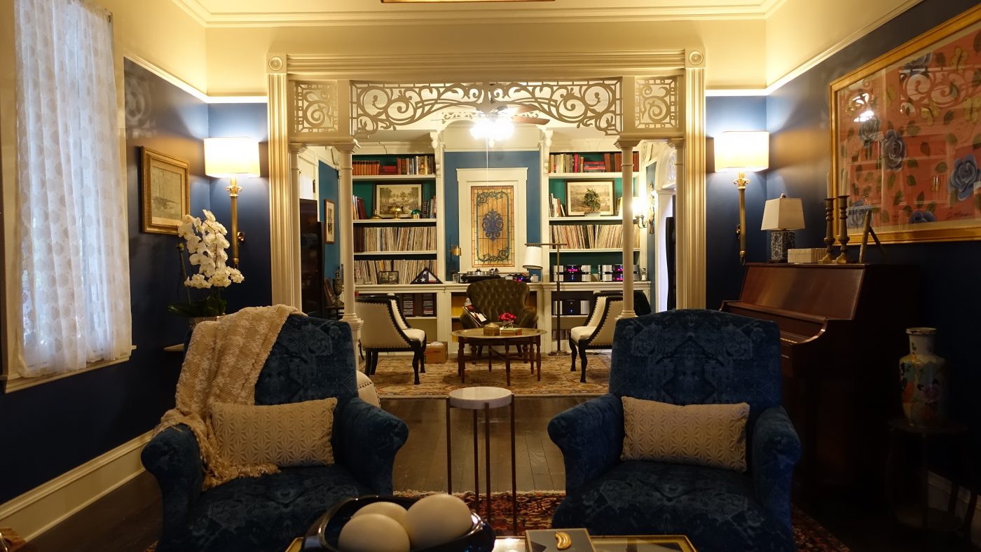
Actually, you know what we really concentrated on was the house. The house is a big character, so we spent a lot of time trying to find a Victorian in Los Angeles since they wanted to keep it in Los Angeles.
At one point there were, and there still are, a bunch of big Victorians in and around the zone of LA (the film zone), but what has happened over some time is all of the land that was around them has been chopped up and sold. These Victorians are hemmed in by modern houses.
We then thought we would build it on location at one of the movie ranches, but then we had the same kind of problems either with the palm trees or where we could put the characters. It didn’t give us the sense of the estate that Adora and the Crellin family would have.
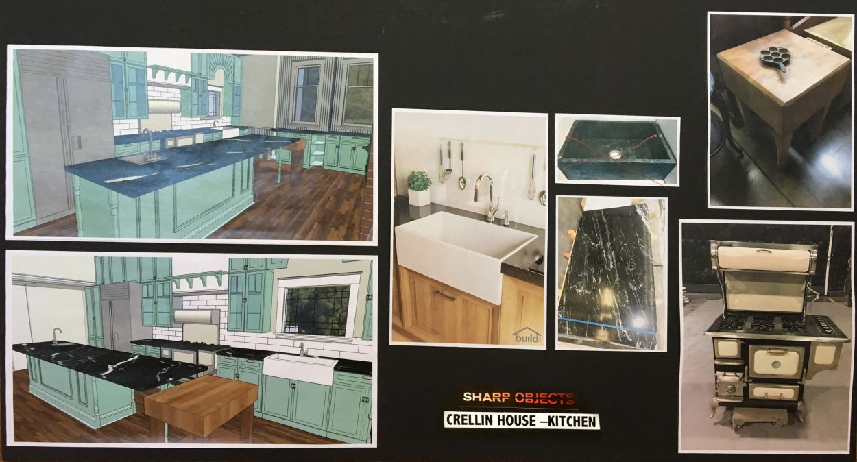
Our location manager was looking around Redding, California when he saw that someone had decided to build a replica of a Victorian on a big piece of property, so we used that as the basis of our exterior. We did build the Victorian interior and a portion of the exterior on a stage.
It was interesting because the people who had built this Victorian in Redding had built the exterior pretty faithfully as to what a Victorian would be. However, the inside was modernized entirely, so we could only use the exterior.
A lot of the research and references came from scouting a lot of the Victorians in Los Angeles and some in Atlanta that we had visited. We put together the interior of the Victorian on the stage, and we also did work to the Victorian exterior in Redding. We painted it and changed some things about it so that it would be better for shooting.

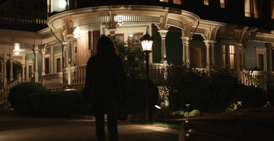 Sharp Objects | Exterior Crellin House | HBO
I was reading an interview with Sharp Object‘s location manager Greg Alpert who said that you guys had to convince the owner to allow you to paint the exterior of the house and you had to choose a colour he could live with since it could only be painted once. So how did you decide on a colour that he would agree upon, but that also worked for the show?
When I do a show I do a lot of mood boards, and I spend a lot of time working with the decorator, but mostly I really focus on colour. So what I did was I found a colour that I felt Adora would have picked. Adora being incredibly wealthy she would have an interior designer from Atlanta or Charleston come up and redo her old Victorian, and that would include the exterior, and it would want to stand out, so I picked that kind of robin’s egg blue-green and I gave the gentleman a couple of variations on those but all were in the blue-green spectrum.
I think they were nice colours and I think that he and I talked to him, and I don’t really know why he was okay with them, but I gave him a range. I didn’t say this is the colour. I think that’s important with everything. I gave him a range and then tried to get him towards more blue than green in the colours, and we were successful.
So you guys added a gate to the property as well?
Yes, we added an entrance gate and we added some windows and doors here and there. We built a little false wall inside when you walked in just so you would have a little bit of crossover with the set and so it would make more sense with how you would enter a Victorian.
Jean-Marc would always prefer to shoot on location, so it’s very important for him to go from interior to exterior whenever the actors want. The exterior was very important to do that, but we did build the interior on a stage.

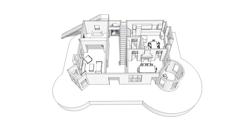
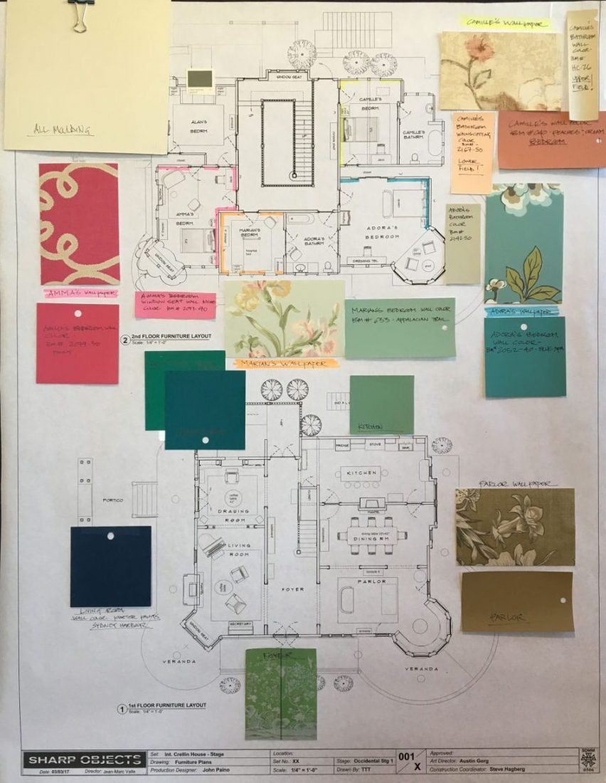 Sharp Objects | Floor Plan with Finishes of Crellin Manor | Courtesy of John Paino and HBO
So the interior wasn’t right, and you did the interior on a soundstage. Did you try to remain faithful to the architecture of the Victorian exterior itself?
No, we were trying to be faithful to the architectural details of what that house would be, but we took carte blanche with the basic layout of a Victorian interior, which you can see that with the side parlour, the front rooms, and the essential staircase.
What I really liked about one Victorian that we almost ended up shooting in, but we didn’t again for the reason that it didn’t have a good exterior, was that it had a beautiful center staircase that went up to an open wrap around the stairwell. So when you go up the staircase, the center of the second floor is open and there’s a hallway that runs in a big circle. The bedrooms are off of this big open hallway and above there is a skylight.
This was a really great way to show the relationships between Adora, Marian, Camille, and Amma and where their bedrooms were. So when Camille had to slink home at night, she would have to go up the staircase and take the long way down the hallway and go past everyone’s bedrooms to get to hers. She might go past Adora’s bedroom, which maybe has the lights on, then go past her dead sister’s bedroom, and then Amma’s bedroom to get to hers.
I really liked the idea and Jean-Marc also really liked it because it would be a controlling thing for Adora too. Adora put the bedrooms where she wanted them as the kids were born just to kind of know what’s going on. Architecturally that would be in a Victorian, but it wouldn’t be common. We just really liked the idea of it, and it was great to shoot in too. We had these long open hallways around the stairwell, which created a lot of places to put a camera to accent Jean Marc’s voyeuristic camera style.

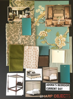
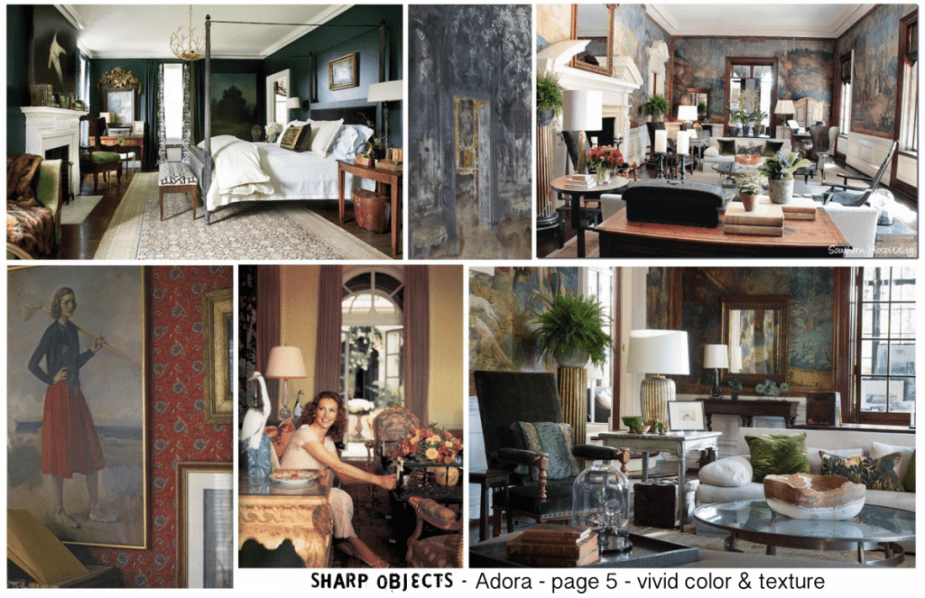 Sharp Objects | Crellin House Moodboard | HBO

 Sharp Objects | Crellin House Moodboard | HBO
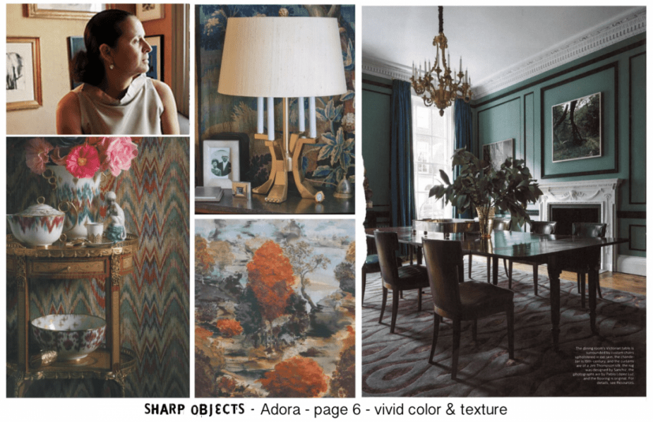
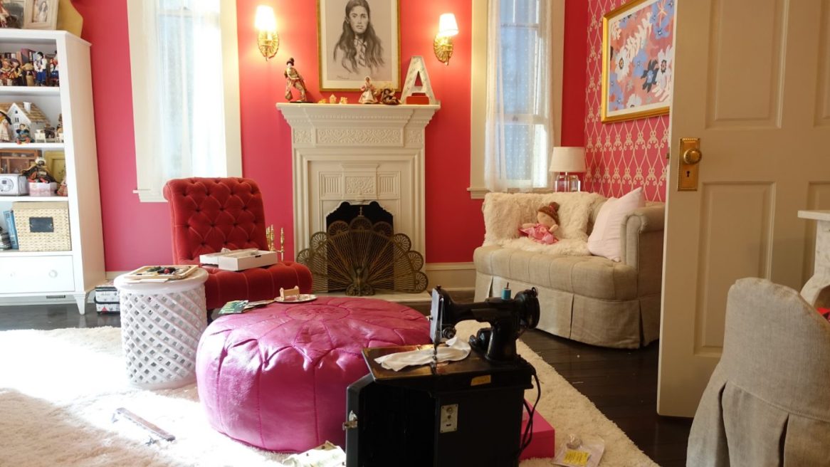
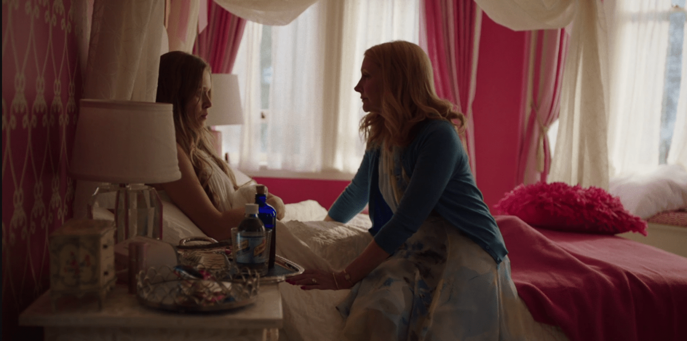
I loved that the interior Crellin home was a very feminine space, but also a very creepy space with a chic chinoiserie vibe.
I think a lot of that is the colour. It does have a creepy vibe. Our set decorator, Amy Wells, did a really great job of mixing in modern and luxe furniture with antiques. In the book it’s portrayed as a little bit more of a faded mansion, you know– painted lady, but we wanted Adora to be a little hipper, and I was all about making the colours swampy and livid almost.
It’s like a theatre set for Adora too. She’s living in this space drinking cocktails every night and dancing. It’s kind of a little bit Glass Menagerie and The Bell Jar for her, but it’s not too antiquey, and she does have money so she would have someone design her space. It’s a little bit on the livid side, and I think the De Gournay wallpaper epitomized that. It’s stylish.
When you have a house with that wallpaper in it, it’s like a piece of art. It will be a signature piece. While that is real De Gournay, when you get the real real real De Gournay, that’s hand-painted on silk, that’s something that’s an heirloom that’s passed down– so that was the idea behind it. The swampy feel of it with the animals and the birds and the plants coming up is creepy in itself, but it’s not in the old Tennessee Williams way. I wanted to have a modern version of it. I wanted it to be colourful, and I think we did a pretty good job of hitting that sweet spot. It’s modern but not too referential.
I was curious given that the wallpaper is referred to in a line of dialogue about it- was there reference in the script to wallpaper or was that added afterwards?
No, they added it later. I picked that wallpaper after seeing a picture of it by the photographer Horst P. Horst of Pauline de Rothschild. It’s a famous picture of her staring into her parlour, and the swamp is just going up the wall, and that was the inspiration. It has a putrid sense of wealth to it, and that was the inspiration for it.

Once you had that inspiration, how long did it take you to get to that wallpaper? Did you scour many other choices?
Amy contacted De Gournay. At first, we tried to have someone recreate it, but it just didn’t do it justice, so we decided to contact De Gournay and just buy it. They just happened to have it. Their stuff is custom made, so we were very lucky that someone had ordered it but had not used it and they sent it back. We were very lucky to get it. It’s made to order, so in some rich mansion somewhere someone decided they didn’t need those 30 odd yards that they ordered and sent it back.
We would never have had it otherwise, and we would have had to use a knock off. I’m really happy that we were able to get the real thing because there’s no comparison between the two. The De Gournay “Chinoiserie Earlham” wallpaper is hand-painted. It’s not silk; it’s paper with silk inlay. It’s amazing. It was a shame to rip it off the wall. We tried to find ways to save it but we couldn’t.
I was really struck by the vibrant colours which are rare to see in this genre. I was curious how you decided upon the blues and greens.
I put together mood boards, but it was really intuitive. I just felt like, what are the colours of the South? There’s just something about those beautiful faded blues. I also thought about poison colours, which led me to arsenic. Arsenic green is a colour that Farrow & Ball carry. I don’t recall if it was called arsenic, but we referred to it as an arsenic green. A lot of paint comes from metals that are toxic, which creates that green, so I just wanted to use those.
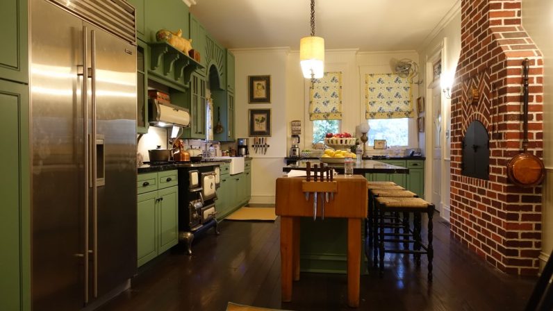
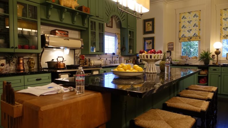
You’ll see, Amy did this great thing in the kitchen. She found these great old antique bottles and filled them with coloured blues and greens. If you go to an old pharmacy, you’ll see bottles of old pictures that are that colour. Adora is poisoning her children, and I wanted to have reference to that within the colour palette. That’s really where it came from.
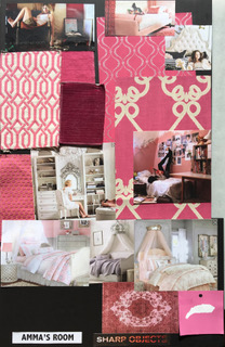
I think it’s very Amma. It’s kind of a little lurid like she is. She’s leading a double life, and even though Adora might have said, I’m going to make your room pink because it’s a girl’s room, I could see Amma being willful asking if it could be a little more of a richer pink– a little hotter.
I don’t usually like doing things gender-specific but because Adora is codifying her children- that was the idea behind that.
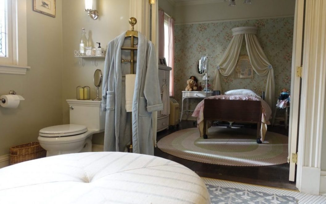
How did you decide upon the look of Camille’s bedroom given her relationship with her mother?
Camille escaped so you can see that at one point. She has old faded, dusty rose wallpaper and colours in her bedroom and I feel that at an early point Adora kind of figured out that Camille wasn’t going to be a perfect child and they started off with pink’s with her but then when she got to be an adolescent she wasn’t as controlling because she had written her off. My impression is that Camille leaves right after high school, so I wanted her to be a little more nostalgic and not too on the nose.
Throughout the show, it seemed like there was a lot of flower motifs and insect motifs. Was that written in or was that Jean-Marc Vallee or was that a collaboration between the two of you?
There was a little bit of that written in, but that’s Jean-Marc and me picking up on it and extrapolating with it. I had tried to read the whole book, but I only got about a quarter of the way through because it’s such a quick schedule.
Working in the South, I think that you notice insects and flowers everything is so present where it’s just part of living. It’s also in the book too. One of the murdered girls love spiders, so she does have an interest in nature but as far as translating it into the chinoiserie that was kind of a happy accident because I always felt that the sight of the swamp was important regardless.

I felt that the insects were complementary to the flower motif.
Yeah, I think it’s about pollination and attracting a mate- all of those things. Sharp Objects has a real kind of grime and sweat to it. I think the most important thing I do as a designer is to create a sense of place and a sense of atmosphere. I think we achieved a definite stickiness to this place and this world and I associate that with soil, insects, plants, vines, water, and sweat.
While we’re still on the mansion I also just wanted to mention how much I loved the fretwork in the transoms above the entrances on the main floor.
That’s a very Victorian thing, and I really liked it. I wanted to make sure it was painted white and glossed over, but that’s a detail that is not uncommon. I tried to make everything a little bit lower so that it would be in the shots and we would see it. It was just another thing to obscure what’s going on.
Had you worked with your set decorator, Amy Wells, before?
The first time I worked with Amy was on Big Little Lies. She’s fantastic. She’s the best. She’s very knowledgeable, and you know it’s really like putting musical notes together. She’s just great and intuitive and has a vast knowledge of period and design, and decorating. I truly consider her a collaborator, a partner in crime with all of these things. I very much focus on the colour and the texture, and the wallpaper and leave the decor with her. We complement each other nicely.
I was curious how you decided on Amy and in general how you decide on the set decorator you will work with?
I think that’s a good question, I have worked with Amy for the past for years, so I haven’t had to think about that.
It’s really hard. Of course, you look at what they’ve done before, and it’s not so much how they did a period film in Texas in the 30s, and I’m going to hire them. I want someone who I can truly collaborate with. I am very much about listening to people. I don’t think it’s good just to tell people- this is what I want.
I want them to collaborate. I want them to bring something interesting to the table, and I’m always interested in hearing things that she knows more about than I do. It would be dumb not to give an ear to those things so I want someone who I feel I can talk to. I think I’m always more prejudiced towards someone who knows about art as opposed to tea cozies because I come from an art background.
I think that with Amy, I certainly looked at her resume and felt I was fortunate that she was available. To answer your question though, I guess I just want someone that I feel I can collaborate with.

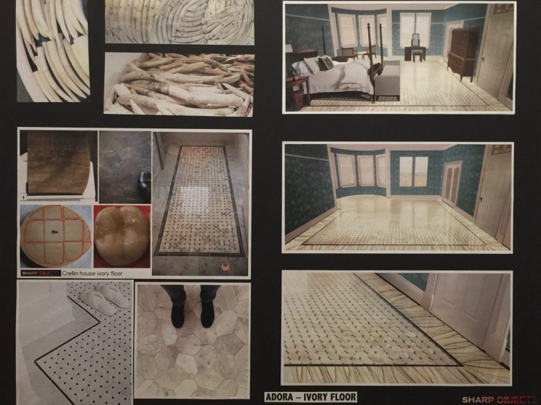
The ivory tile: I was reading that it doesn’t really exist, but you had to create it for the show so I was wondering if you could just talk about your process for that?
I just assumed someone had done it, and when we talk about ivory, it’s from the tusks and teeth of animals. It is whale, elephant, rhino, walrus, narwhal tusks and teeth. I thought someone must have done this, some Sultan in days of yore, but no, I couldn’t find anything. I certainly found a lot of inlay ivory on furniture or keepsake boxes or things like that, but nothing on the scale of this.
It’s such a great idea of the author that these people are so wealthy that they would do this. And the tricky part was, we wanted it to feel like it was part of the Victorian motif- like it had been made between the 1840s and the 1900s, but we also wanted it to feel like that could be ivory, I can see how that could be ivory.
So I did a lot of drawings, and we looked at a lot of references, but I finally thought the best thing to do, instead of it just being regular tiles, we could do tile but show the cross-section of a tooth in each tile. A tooth is kind of gross. Teeth grow like a tree has rings, so we showcased that, and I felt that was a good way to show that.

We felt it wasn’t enough so in the border we used cross-sections of horns to make it feel like, okay, this could be a tusk, this could be an ivory tusk, this is an ivory tusk cut in cross-section like a tree. So I thought between showing those growth rings in the tile and showing the shape of what could be elephant tusks or rhino tusks, or walrus tusks at the border of the floor, it would work. You want to see it and not have to explain it- you want it to fit in and look like a craftsman would have just laid this in. We put a coat on it because it had to last and there are also a lot of scenes of it being polished, but I feel like it looks like it’s been in there.
I’d have to point to that and say that we were all very happy how that ended up looking since we couldn’t lay it in. We didn’t have the time; it wasn’t even a money thing- we just didn’t even have the time to lay a floor like that. We were so pressed to get this set done. We did it in 12 weeks, which is really fast, so we were really pressed to get it done. We actually printed that on vinyl and had the grout lines embossed, and we played with how much of the grain we needed to see. I would have loved to inlaid it, but we just didn’t have the time.
What sold it for me was the shape of the tiles, the curved corners. I can only imagine there are people out there now trying to get this type of floor, which is creepy for sure.
Good luck. No, it is creepy. I’m sure there’s someone who would love to. It’s so sad. I hope that no one ever does that. I hope they have to do it fake. Just make it out of plastic.
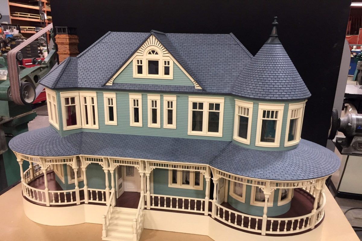
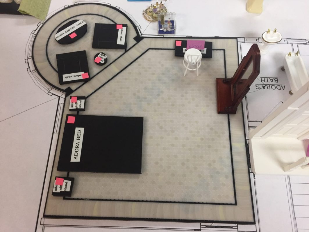
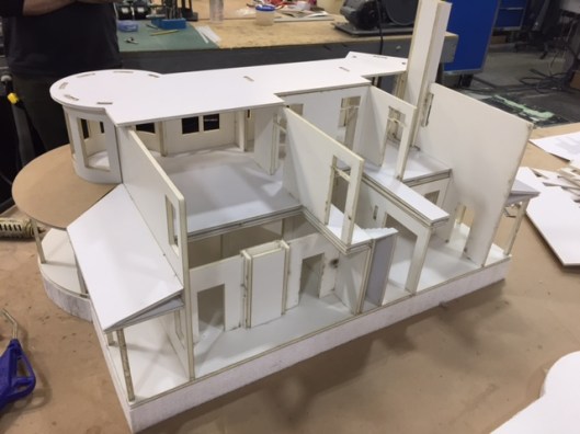
So with the dollhouse, you were designing and building the dollhouse at the same time as the house. What was your schedule like? So you had 12 weeks to do the whole house and the dollhouse?
The dollhouse could have a little more time. The house had to be designed before the dollhouse, and I think we had plans within three or four weeks. So then the house was made from those plans, but the thing about the dollhouse that made it deceptively hard was that Amy was figuring out the furniture, wallpaper, and fabrics simultaneously.
Will we get the De Gournay wallpaper? Will we get this wallpaper? Amy might bring in three or four different couches and say, okay, that one doesn’t work, we like this one, that one turned out to be too big, I’m going to get that upholstered, or reupholstered– that kind of thing.
That all had to be done at breakneck speed. So the dollhouse is beautiful, but the thing to realize is the speed it was done. It was amazing, I mean our propmakers and our prop master, Hope Parrish, did a fantastic job in such a short a period of time.
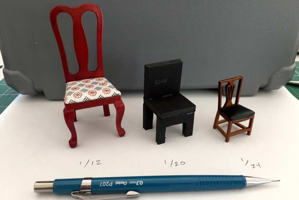
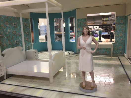
The other thing is- there are different scales for dollhouses and the scale that worked out best for shooting was one where you cannot get generic pieces, so everything was made from scratch, every single thing.
Some of the furniture we were able to get 3D printed. I know that we printed the figurines inside as well, which we also had to get their costumes for that. It became an insane obsessive really complicated, harder thing to pull off than I thought it would be. I knew it would be expensive, I knew it would be time-consuming, but the other thing too is sometimes when you reduce things, it doesn’t look right.
Like if you take a wallpaper that’s intricate, and you reduce it to the proper scale, it doesn’t always look right, so it just looks like dots of colour. It may be technically right, you know, okay, that’s 3/4 scale, but it doesn’t really look right, it doesn’t look appropriate, so there was a bit of playing with scale too. So you can’t just put everything into a miniaturizer and be done.
So what was your schedule like?
The build was 12 weeks, but I started earlier because I’m putting things together and putting colours together and scouting. We were seeing if we could use an existing Victorian. I never thought we’d be able to use an existing Victorian because here’s the other thing with Victorians- they’re small, and ours was small, but it was certainly shootable. We wanted to make sure it wasn’t fake big, and Jean-Marc doesn’t pull walls. He shoots sets like locations. He does not pull walls.
So with the smaller locations like the Keene house, I imagine that was difficult to find a house big enough to shoot but socioeconomically correct for the character.
Yeah, all of those ancillary houses, you know, a lot of them had to be adjusted. We built the Victorian, we built the bar, we built a few of those houses but a lot of them we wanted them small. There’s a real dichotomy between the Crellin’s home and the rest of the town.
Plus everywhere we went we always painted and played off of that colour dynamic, but in a lot of those houses, we’d move a doorway or get rid of a window or add a window because Jean-Marc likes to use available light.
Our art department usually provides a lot of practical lighting that is a good 75% to 85% of what is causing the exposure. He hates big lights through a window so we’ll put a window in, we’ll make a window bigger, things like that on locations.
So you said you guys built the bar and some of those smaller spaces. Can you tell me a little bit more about that?
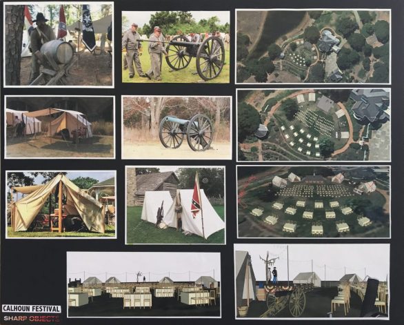
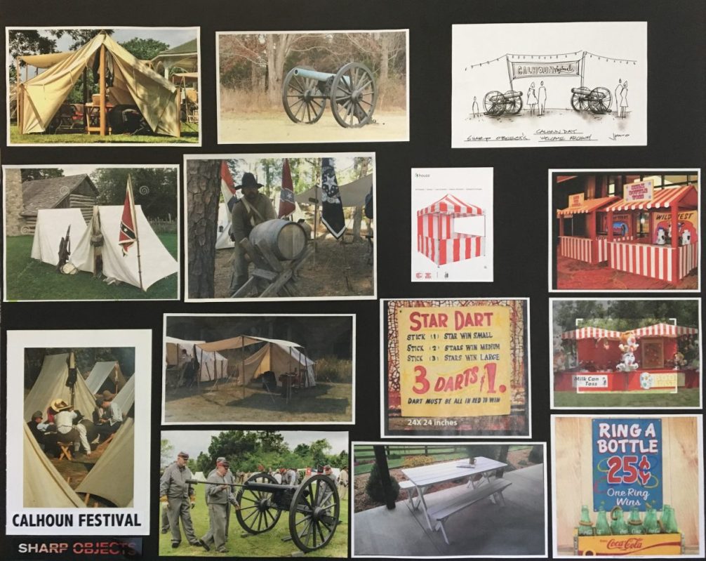
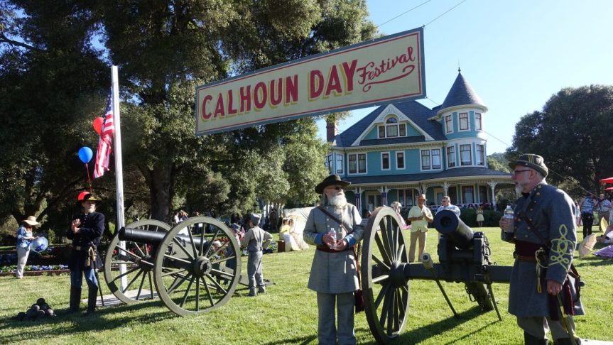
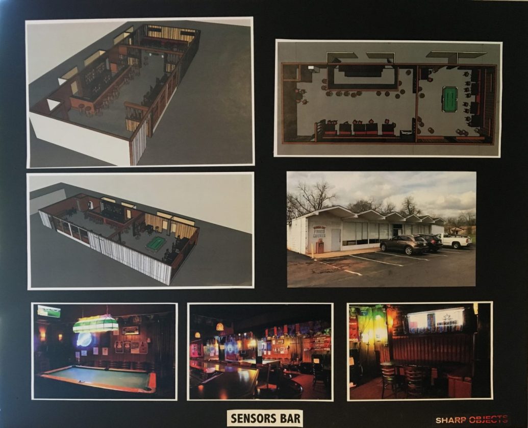
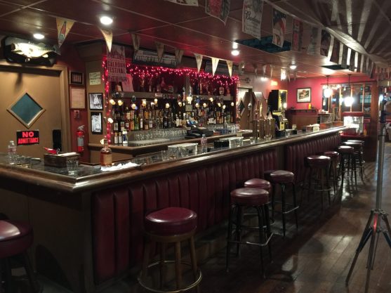
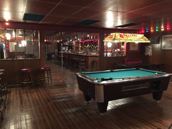
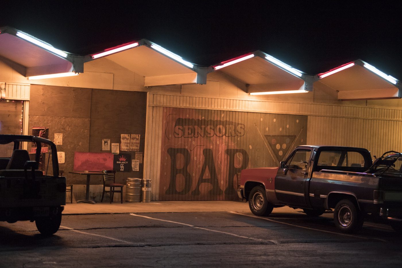
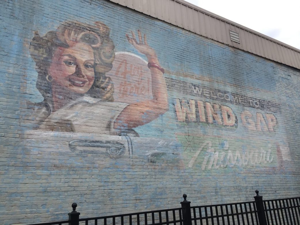
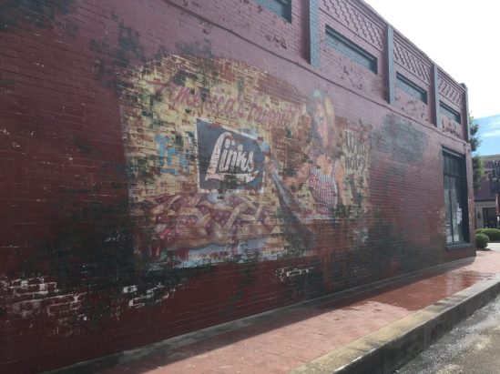
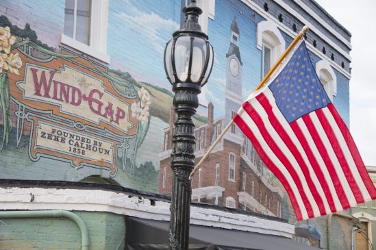
Yeah, we built the bar. We built a lot of stuff for the festival. Everything for the Calhoun Festival was built. We built the hunting shed and the barbershop. We did a lot of work to create downtown Wind Gap. A lot of signage and a lot of dressing.
Can you tell me a little bit more about the neutral colour palette you used for most of Wind Gap, Missouri and what inspired your vision of the town?
The town is a Rust Belt town. There’s still colour in it, but it’s faded. There are still some fecund colours. The bar is livid, and the bar was a really great, fun set to build. We built it because we were going to shoot in it so much that we needed to control it. We had to make it a certain size, a certain length. It was the idea of having someone down at one end of the bar and someone down at the other. It was just special.
The idea was that life has faded from the town. The town was hopping in the ’40s, and ’50s and then in the ’60s everything is bleached out. Now everything is even more bleached out– the town started to lose its stability in the ’60s and ’70s, so that is the idea.
I looked at a lot of photos of Rust Belt cities. I looked at a lot of photographs that chronicled towns everywhere from Upstate New York to Ohio to the South where, for want of a better word, they’re Rust Belt towns where the industry has left, and people are trapped. Things are decayed and desiccated, and I picked up on the common denominators no matter where they were, and we put them into the town.
How did you choose the imagery for the hand-painted signage around Wind Gap?
We wanted it to be a throwback to that idealized Coca Cola ad signboard style, and as it happened, in one of the towns we were scouting, which we ended up shooting in, there was a mural up that had the big smiling face of the Coca Cola ads of the ’50s and we really liked it.
We wanted to have vestiges of that era in the town here and there. So the gentleman who painted that sign actually grew up in that town and lived there. He’s one of the best sign moralists in the country, so it was amazing that he was able to do it for us.
I did some drawings for him just for the layouts, and he carried them out on the sides of buildings. There were some existing murals in town that would say Barnesville, and we had him paint Wind Gap, Missouri over them. We had him just go to town, literally. I would do preliminary drawings, and he would take it from there.
What do you use to draw? What’s your choice of materials to get your ideas out?
I used to draw with markers and Japanese pens and Pentel sign markers. I would do everything in markers, but now I draw on an iPad because it goes straight to digital, but I wish I could spend the time that I used to spend drawing with markers. I would love to do that, but sadly, there isn’t that amount of time anymore.
We did have an incredible previsualization artist. We hired Joanna Bush to do some wonderful previsualization and photoshop comps too, but I like to draw the big kahuna stuff. I think there’s also something about the signboards that conveyed the emotions of the show, so I wanted to knock off a sketch to show them. Sadly there just isn’t enough time anymore to do all of this stuff.
The other thing I noticed in the show was all of the hidden Easter eggs. When people rewatch the show, I think there’s a lot there for them to see. There are hidden words everywhere– words in the graphics and carved into furniture.
That was something that Jean-Marc came up with. It was this brilliant idea because Camille is an alcoholic, what she sees– you never really know if she imagines things. Some of those we carved, like her desk at home we actually carved, and other things Jean-Marc added in post.
So some of the graphics were altered in post?
I’d say it was 50/50. Yeah, because as he’s editing, he’s the type of director where if he could edit until the last second. He’s always refining things intuitively, and he’s picking up things, like, oh, well, I wish I had this. So yeah, a lot of them he added in post and some we put in the set and some we just did on the fly before shooting.
Like in her cubicle in the newsroom, I don’t know if you see this, but there’s a cubicle where we pushed the pushpins to make a word. That’s also a hearkening back to the fact that she cuts herself. Part of her MO is that she writes things everywhere, including her body. It’s a metaphor that you can show visually and a clue if you’re paying attention enough to see who she is and where she’s headed. Not a clue to who the murderer is but certainly a hint into who Camille is and how she sees the world.
Yes, it often shows what she sees in other people too. I like that it just said “Girl” in one of the pieces of artwork in the dollhouse as that’s how she sees Amma. I also liked that the written language becomes part of the design aesthetic because it’s so well woven into everything.
Yeah, I’d have to say Jean-Marc did a lot on the fly and he did some in post. You know, those are things that as the scripts are being written, as the storyline is being developed, you want to be able to add those things. We don’t have everything, not everything is written.

So on Sharp Objects, you didn’t have all of the scripts in advance? So you guys had a normal TV schedule in terms of getting the scripts as you go along? Sometimes I assume most miniseries have their scripts all ready from the get-go, but it’s interesting to me that not all of them do.
I think Jean-Marc likes to challenge them. He likes to work with them. I think that is unique. I think on a regular TV show with multiple directors you have the writers, not that the writers and the showrunners are not important, but he does like to work with them. He’s more visual as opposed to written, so he’s going to go in and augment things, you know, with everyone’s agreement, but that’s part of his working style, and he relies on doing some things in post in order to flesh out his ideas.
Thank you so much for your time and congratulations on all of your recent successes.
Thank you. It was a pleasure.
Watch John Paino Discuss Sharp Objects’ Production Design
What did you think of Sharp Objects? Are you familiar with production designer John Paino’s work? I’d love to know what you think in the comments below.
[…] submitted by to r/sharpobjects [link] […]
Great article. Loved reading all the insight and looking at the thought on the amazing detail, even the paper in the walls (I would never have thought of it). Thank you!
I adored the house so much- and the paintings that hang in upstairs hallway were gorgeous- who is the artist or artists of the pieces?