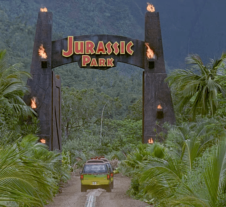
The true brilliance of Jurassic Park’s graphic design is the cohesive branding of the theme park island that frames the film and makes it more believable. Production Designer, Rick Carter’s look for Jurassic Park – both the theme park and the film – eschews Michael Crichton’s “Voyage to the Land Before Time that Time Lost” tinplate aesthetic for a cutting edge clean that is wonderfully 90’s, lurid and tacky. At the time it was incredibly fresh and while it’s easy to date it now, it doesn’t look particularly dated.

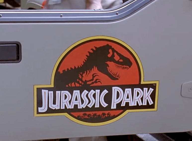
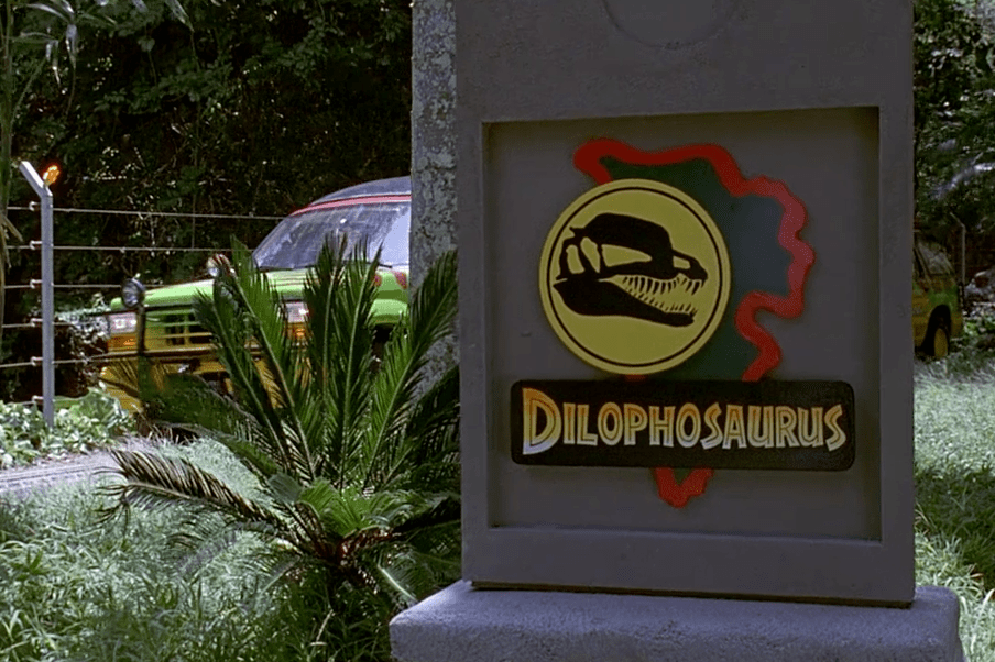
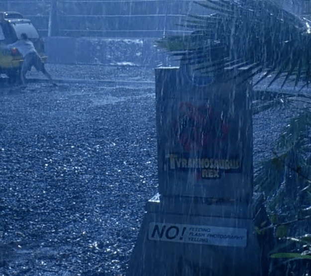
The design language is a very simple one, emphasising sticky streaks of bold colour. Of particular note is the skeletal iconography, not only for the main corporate logo but also the stone obelisks that denoted the individual dinosaur paddocks.
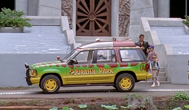
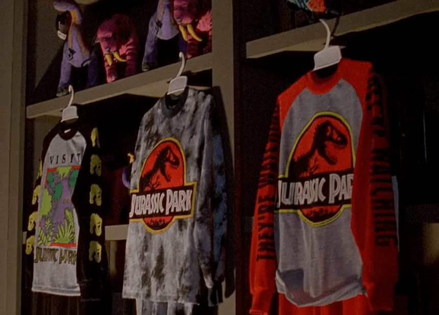
The Ford Explorer colour scheme is an excellent analogue to the artifice of the park that Ian Malcolm and Alan Grant frequently pick John Hammond up on – their quasi dinosaur-print paint job is done in the most lurid, artificial colours possible that you wouldn’t find in the natural world. In fact the film’s design embraces tacky artifice with abandon – the cheap plastics, the eye popping paint, the toys and the t-shirts. This push towards a showy, fake external imagery actually has the effect of making the jungle – and the animals – much more real to the viewer. They’re more believable in containment and isolation, and when things go wrong and they escape that containment the stakes are higher. For me it’s the strongest example of Rick Carter and Spielberg working together; where direction and design, tone and intent meet perfectly in the middle.
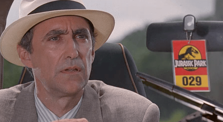
Numeric vehicle plates and tags cleverly suggest a much bigger park system than is actually depicted in the film.
The “Jurassic Park Look” consequently became adopted by zoos all over the world and even in 2013 signs done in the Jurassic Park corporate font can still be found on penguin enclosures in places like snow-swept Edinburgh, which is as far away from the tropical sweat of Islar Nublar as you can get.
Are there any films you love that have distinct corporate branding that enhances the design and story?
Matthew Clark | @mr_clark
[…] ← JURASSIC PARK (1993): Part 1- Corporate Branding, Identity and Signage The Ten Commandments of Production Design → by Matthew Clark | October 30, 2013 · 9:00 AM ↓ Jump to Comments […]