Aside from the exterior corporate identity (see Part 1) of Jurassic Park, production designed by Rick Carter, there was a distinct and different internal bit of design behind the flash exterior of the park. Of particular note – but often over looked because of the much-mocked UNIX system used at the denouement – is the park control system.
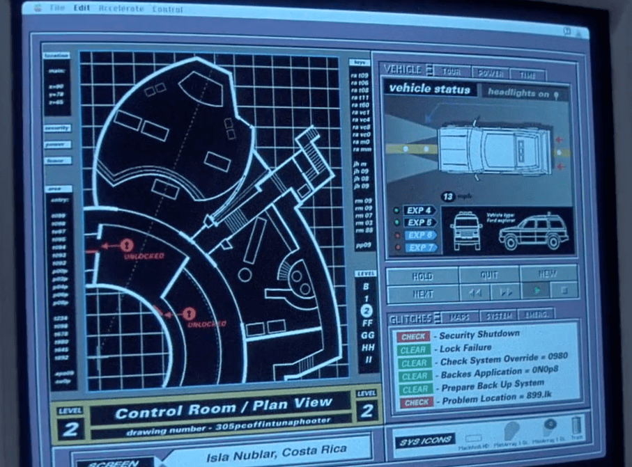
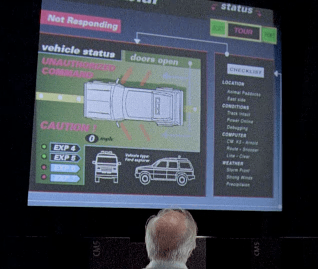
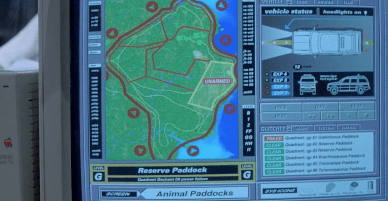
It’s actually one of the better examples of an OS made for the screen, because it’s graphic nature tells the viewer everything they need to know in the scant seconds that it’s on screen, without resorting to ridiculous exposition graphics (see The Net and basically every other film with a computer ever). Likewise the interactive CD-ROM – as 90’s a term as you’ll ever hear – was fairly authentic, featuring fairly grounded graphics and playback video.

There were minor forays into folly – the VR DNA sequencing as well as the banks of Cray computers were a bit much – but overall, the relatively realistic computer systems helped sell the illusion that this was a functioning, working park. The artifice of the park’s tourist exterior was very carefully tempered with grounded, messy cables and bare concrete interior.
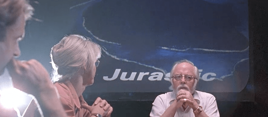
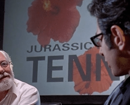
The lunch / boardroom scene features a number of hidden gems in the form of photographic slides advertising Jurassic Park as a brand and an expanding concern. Briefly visible is an advert for “Jurassic Park Tenerife” with a very different branding to the Isla Nublar park, as well as other concepts such as “Jurassic Airways” which presumably would be charter flights to Costa Rica.
Profit projections also appear on screen. These graphics are never clearly seen and don’t appear in the art books, which is a shame, because they’re a fantastic piece of well thought out, background storytelling.
Finally a couple of images showing the more practical side of the park, including the no-nonsense fence warning signs, as well as the numbering and plating system on the red utility Jeeps. Less flashy than the tourist vehicle Explorers, the bold but clean graphic finish suggest a much more utilitarian use.


Are there any films you love that have distinct playback design that enhances the production design and story?
Matthew Clark | @mr_clark