Welcome to the illustrious realm of the Pantone Color Institute and the sophisticated domain of the Pantone Color Matching System. Nestled in the cultural tapestry of New Jersey, the Pantone Color Institute stands as a beacon of precision and creativity, curating a palette of 2161 colours that transcend mere pigments to become integral storytellers in the design world.
In this exploration, our focus turns to the Pantone Matching System (PMS), a groundbreaking tool that revolutionized colour standardization across diverse industries. As we navigate the history of Pantone, from its modest beginnings in the 1950s to its current status as a global colour authority, we uncover the meticulous craftsmanship that goes into harmonizing colours internationally.
Picture a universe where every designer, regardless of geographical location, converses effortlessly through a universally recognized palette. Our journey will traverse the intricacies of CMYK wonders, explore the luminosity of metallics, and revel in the subtleties of fluorescents and pastels.
The Pantone Color Institute, with its commitment to precision and innovation, serves as our guide through this chromatic odyssey—an arena where each colour assumes a distinctive narrative. Join us in unravelling the sophistication of Pantone, where creativity flourishes within the framework of standardized brilliance.
What is the Pantone Color Institute?
The Pantone Color Institute, a Pantone LLC subsidiary, is an influential entity in the world of colour. Headquartered in Carlstadt, New Jersey, Pantone is renowned for its proprietary Pantone Matching System (PMS). This colour space has become a linchpin in various industries, including graphic design, fashion design, product design, printing, and manufacturing.
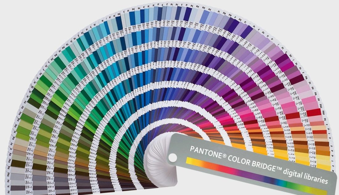
Founded in the 1950s by Mervin and Jesse Levine, Pantone’s transformation into a colour authority began when Lawrence Herbert, a Hofstra University graduate, joined as a part-time employee. Herbert’s chemistry expertise streamlined pigment management, leading to the establishment of the Pantone brand in 1962. The company’s primary products, the Pantone Guides, are indispensable tools for designers, featuring a comprehensive array of colour swatches bound into easily navigable fan decks.
The Pantone Matching System facilitates precise colour reproduction during the production stage, ensuring consistency across different mediums and materials. Widely adopted by graphic designers and printing houses, the system’s guides, regularly updated to counter ink yellowing, remain an essential resource for those seeking colour accuracy and uniformity in the ever-evolving landscape of design and production. The Pantone Color Institute continues to shape the visual language of industries, offering a reliable and standardized approach to colour management.
What is the Pantone Color Matching System?
The Pantone Color Matching System, a cornerstone in colour standardization, ensures consistent colour reproduction across various industries. As of 2019, the system encompasses an impressive palette of 2161 standardized colours. This extensive range facilitates worldwide communication and collaboration, allowing manufacturers to match colours without direct interaction.
One essential application of the Pantone system is standardizing colours within the CMYK printing process. CMYK, utilizing cyan, magenta, yellow, and black inks, is a prevalent method for colour reproduction in the printing industry. Pantone provides a subset of colours specifically tailored for CMYK reproduction, indicated in the company’s guides for easy reference.
While a substantial portion (about 30%) of the Pantone system’s spot colours cannot be replicated using CMYK, the company introduces an alternative method. These 1114 spot colours, identified by their allocated numbers, can be simulated using 13 base pigments, including black, mixed in specified amounts—called base colours.
Beyond the fundamental colours, Pantone expands its offerings to include unique colours such as metallics, fluorescents, and pastels. These variations broaden the creative possibilities for designers, with specific codes designating each unique shade. The Pantone Color Matching System continues to be a cornerstone in the world of colour, providing a universal language for designers, manufacturers, and consumers alike.
The Pantone Color Institute- Where Color Comes First
What Pantone products and colours are you in love with? As always, let us know your thoughts in the comments below.
Oh wow I love the mugs and the Rubiks cube… such a clever idea!